Orbit
College students apply to dozens of jobs with no structure, no feedback, and no idea which listings are even worth their time. Orbit is the co-pilot that actually understands what a student job search looks like.
View Prototype ↗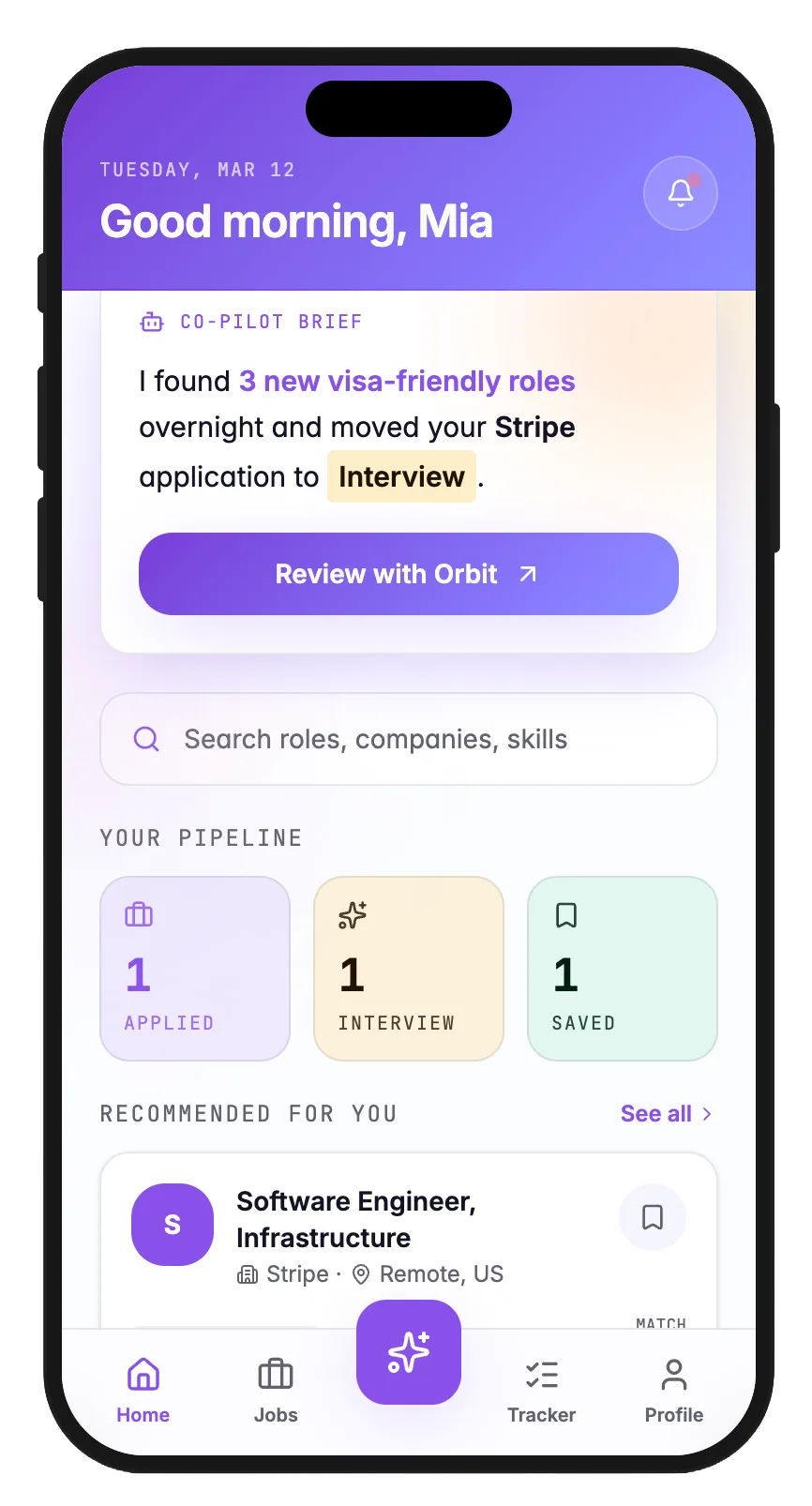
College students apply to 40 jobs and hear back from zero. The problem is not access to listings. It is signal versus noise. Orbit is the co-pilot that filters, tracks, and helps students apply with confidence.
A class project for ISTE264 at RIT, completed in under two months. As project manager and UX designer on a team of three, I contributed across all phases: five user interviews, affinity mapping, three prototype phases, and a five task usability study from paper sketches to a high fidelity Figma prototype.
100% task success rate. 1.44 average clicks per task. Four design iterations made directly from usability testing observations.
The Problem
Forty applications. Zero callbacks. No idea what went wrong.
College students apply to dozens of jobs across six different platforms with no system, no feedback, and no filter for which listings are even worth their time. The problem is not access to opportunities. It is signal versus noise.
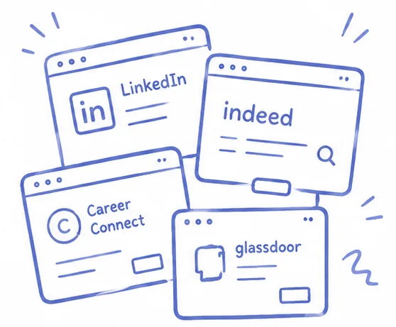 Fragmented search
Students juggle 6 or more platforms simultaneously. None of them talk to each other.
 The visa barrier
40% of international students say visa sponsorship filtering is their biggest job search barrier. No major platform solves it.
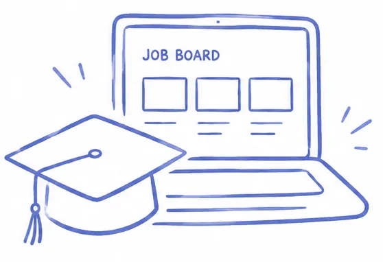 No tool built for students
Zero major job boards designed specifically for college students with their actual constraints. Skill level, visa status, academic timeline. None of it.
Research
We interviewed students until we stopped hearing new problems.
Four semi-structured interviews with RIT students across different majors and years. We were not looking for feature requests. We were looking for the underlying shape of the problem: what students actually do, where they get stuck, and what they have quietly accepted as broken.
click a person to read their insight
Select someone from the research.
Four interviews is a starting point, not a conclusion. These themes gave us enough directional confidence to begin designing. But a larger sample, especially with more international students across different visa situations, would have strengthened the findings. Given the scope of a semester project, we prioritized iteration speed over research depth. That tradeoff is worth naming.
Competitor Analysis
Every tool that existed already. None of them built for students.
We analyzed Career Connect and LinkedIn before designing anything. Both solve part of the problem. Neither solves it together, and neither was built with a college student's actual constraints in mind.
Centralizes RIT-partnered listings. Students can apply directly without re-uploading documents.
No status updates after applying. Users redirect to multiple external portals. Interface feels outdated with no adaptive recommendations.
Flexibility and Efficiency. 2 out of 5. Frequent users cannot customize or streamline repetitive actions.
Largest professional network. AI-powered job recommendations, skill learning suggestions, and mobile accessibility.
Overwhelming and cluttered. Low recruiter response rates. Premium features locked behind a paywall, a real barrier for college students.
Aesthetic and Minimalist Design. 3 out of 5. Ads, games, and news distract from what students actually need.
Both platforms leave students without personalization, transparency, or a system that understands their actual constraints. Skill level, visa status, academic timeline. That gap is where Orbit begins.
Who We Designed For
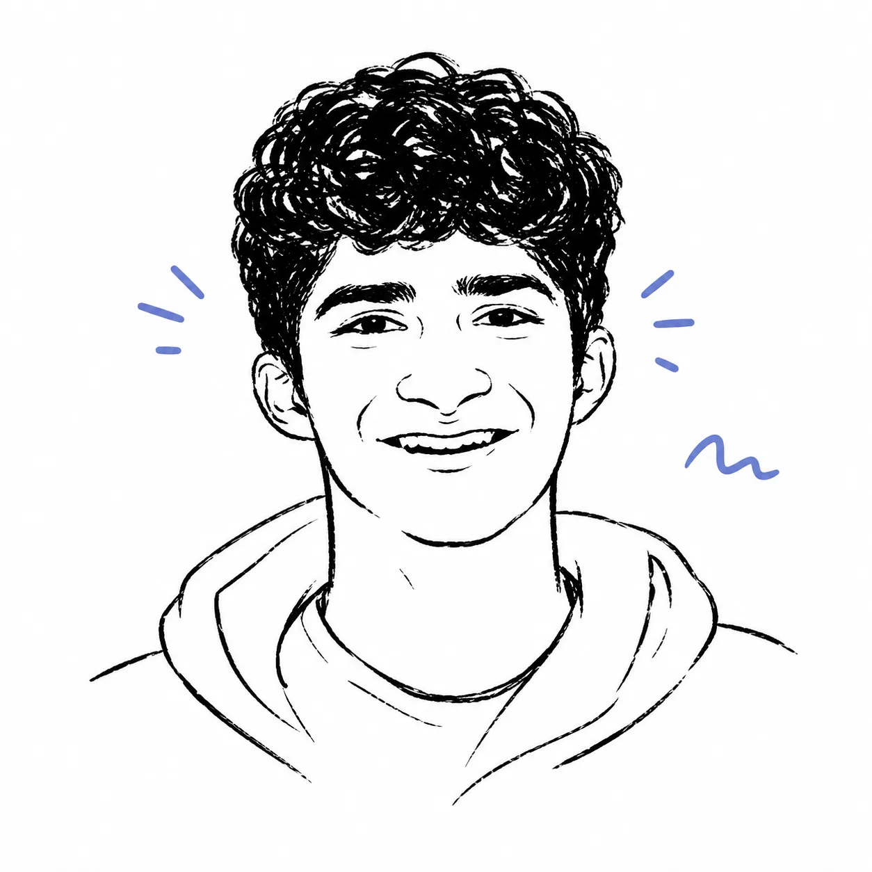
Dev Patel
Age 21 · Game Design · 3rd year · International student
"I need to know in 30 seconds if this job is even worth my time. Right now it takes 30 minutes."
Dev is a third-year international student actively searching for a co-op. His previous experience was not field-aligned and he needs structure, clarity, and confidence in his next search.
Goals
- Land a co-op that sponsors his OPT
- Know within minutes if a listing is worth applying to
- Stop losing track of applications he submitted weeks ago
Frustrations
- Hours spent filtering out roles that do not sponsor visas
- Cannot tell if his skills match without reading the entire description
- His spreadsheet has 60 rows and he still missed a follow up last week
Design Process
From paper to pixels.
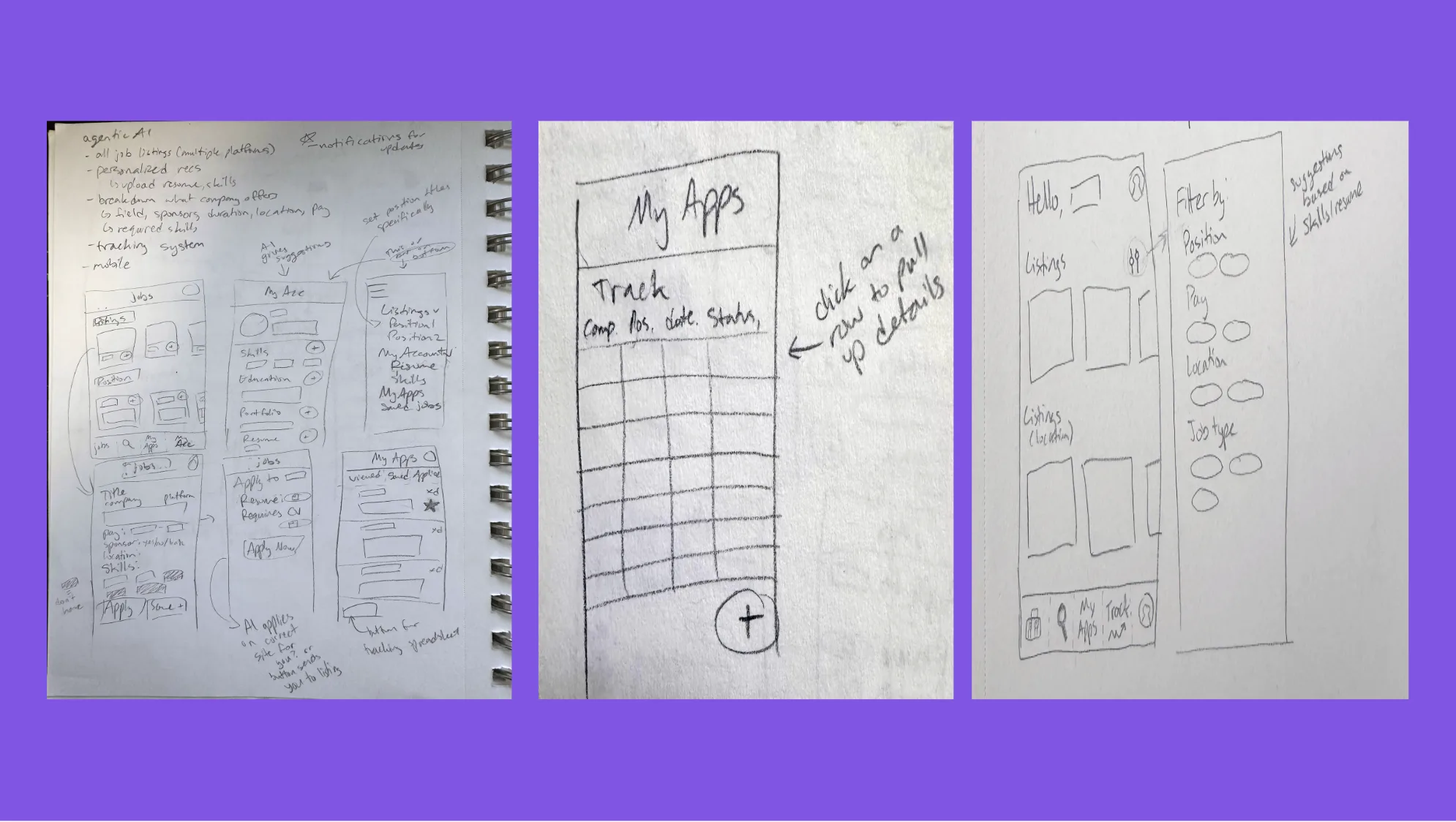
Phase 01 — Wireframes
Paper first. Sequence before screens.
Phase 02 — Mid-fi
Greyscale and interactive. Structure before color.
Phase 03 — Hi-fi
Full visual design. Real tasks. Real constraints.
Usability Testing
100% success. But the details told a different story.
Four participants. Four task scenarios. Time-constrained to simulate a real job search session between classes. Aggregate success was high. The interesting data was in the click paths and error patterns.
task success rate across all 4 tasks
average clicks per task — well within the 1-3 click target
What the numbers do not show
The 0.5 error rate came almost entirely from one place — and it was the one we had deprioritized.
Two participants took longer paths on the AI cover letter task suggesting the entry point was not as obvious as we assumed. Nearly all errors traced back to the profile setup flow which we had treated as lower priority. That was a mistake we fixed in iteration.
What we changed.
AI cover letter CTA buried in menu
Moved to job detail page — contextual to the listing being viewed
Visa badge buried in listing footer
Moved to prominent position next to company name
Profile setup felt like a form
Split into progressive onboarding — one question at a time
Status label said Pending — felt ambiguous
Changed to Applied. Waiting to hear back. Plain language over product jargon.
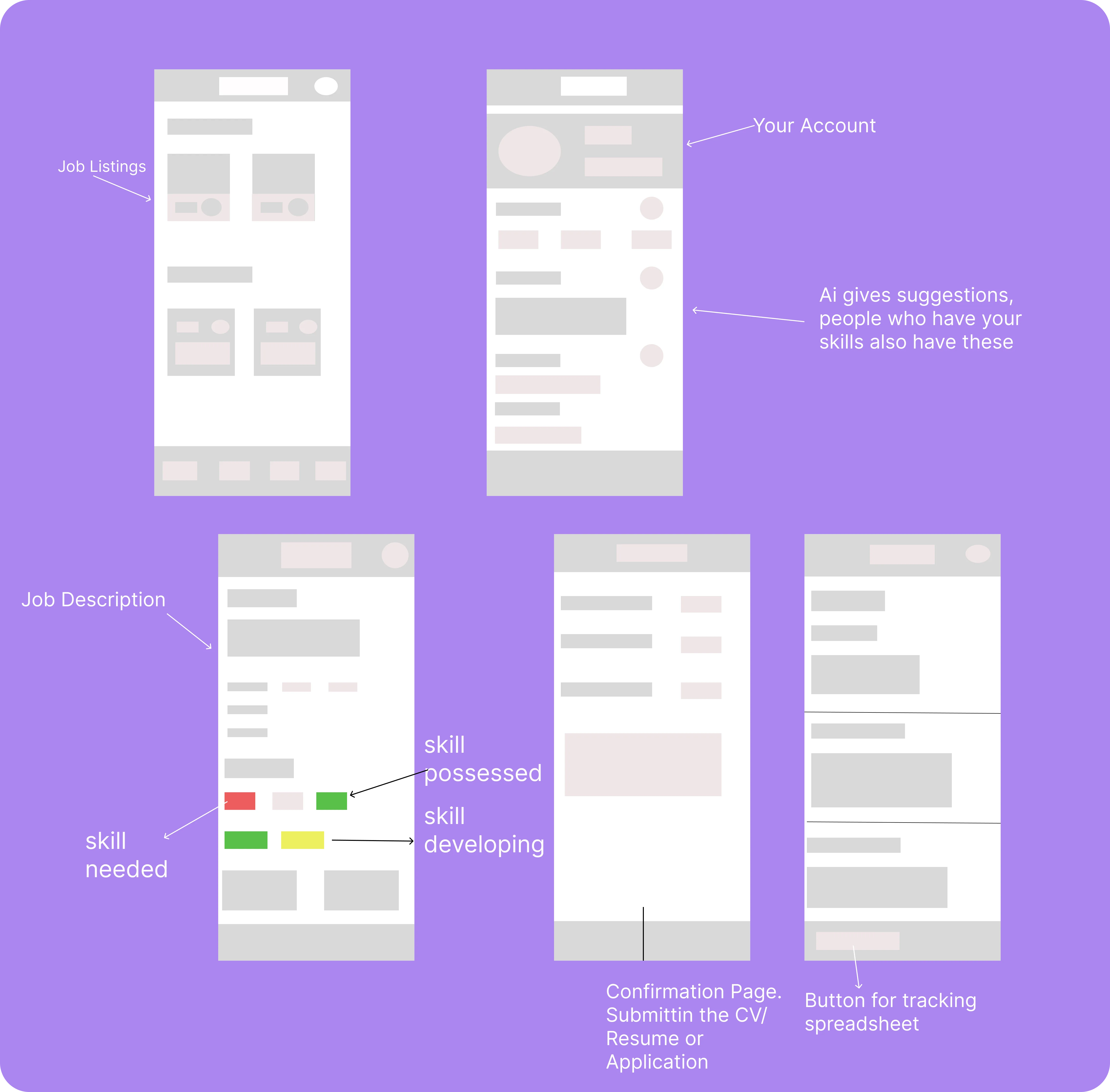
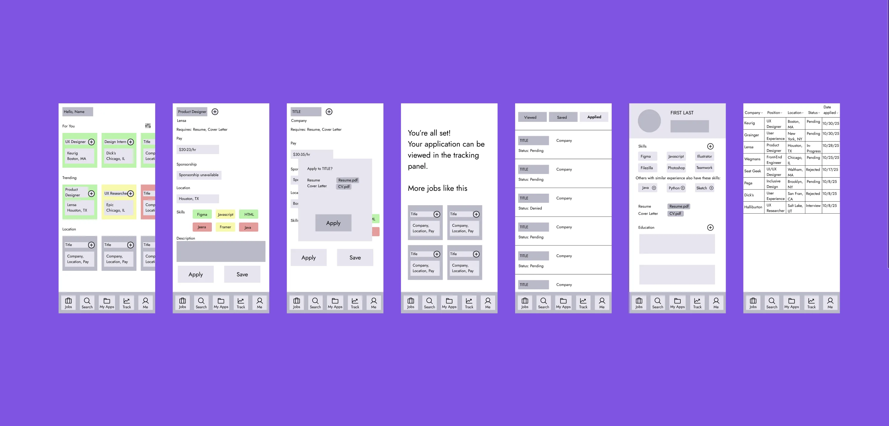
Key Features
Built for the job search no one designed for.
Prototypes shown reflect final designs refined through usability testing.
A single view of where you are in your job hunt. Applications in progress, follow-up reminders, and recommended next steps. You should never have to hold the status of 40 applications in your head.
Software Engineer returns 50,000 results. Your skills in Python, React, and SQL return 200 jobs you can actually apply to. The confidence gap starts closing here.
Every listing is labeled. Sponsors OPT. Sponsors H1B. Does not sponsor. The most requested feature across every single international student interview — and the one no major job board has built well.
Save, apply, follow up, hear back. All tracked in one place with status labels and dates. The spreadsheet students have been building manually for years — now built into the product automatically.
The AI writes a first draft of your cover letter based on the job description and your profile. You edit it. You send it. Students wanted AI to handle the time-consuming part so they could focus on making it actually theirs.
See it in action.
Open Prototype ↗Key Takeaways
The visa feature almost got cut. It should have been the headline.
Every single international student participant mentioned it unprompted. That is not a niche — that is an unmet need every major job board decided was too difficult to address.
Co-pilot over catalog was the right framing from the start.
Every time a feature felt bloated we asked — does this help the student navigate or does it add noise? That question cut about 30% of originally scoped features. The simplicity is not accidental.
Test onboarding in Phase 2 not Phase 3.
Profile setup errors surfaced late because we deprioritized it. Onboarding is always the highest friction moment — it should be tested first not last.
Next Steps
Build real-time job data integration.
The prototype uses static listings. A live version would aggregate from LinkedIn, Indeed, and Handshake simultaneously — the single source of truth every participant asked for.
Expand visa sponsorship intelligence.
Current labeling is manual. A trained model that reads company hiring policies and flags sponsorship status automatically would be the feature that makes Orbit irreplaceable for international students.
Add employer response tracking.
Students currently have no visibility after applying. Automated follow-up reminders and response likelihood signals would close the feedback gap that causes the most anxiety.
Test with international students specifically.
Our sample was diverse but small. A dedicated study with international students navigating active visa sponsorship requirements would produce sharper and more actionable findings.