Lost and Found
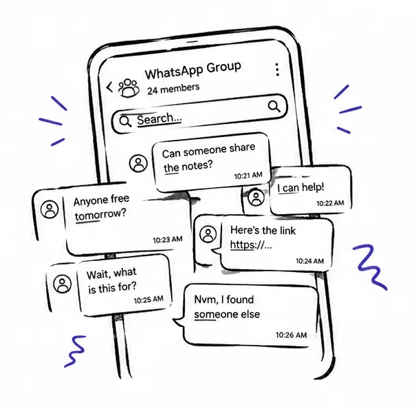
VIT has over 10,000 students and a lost and found system made of five WhatsApp groups. No search. No privacy. No way to know if anyone even saw your post. Six weeks to design something people would actually trust.
View Prototype ↗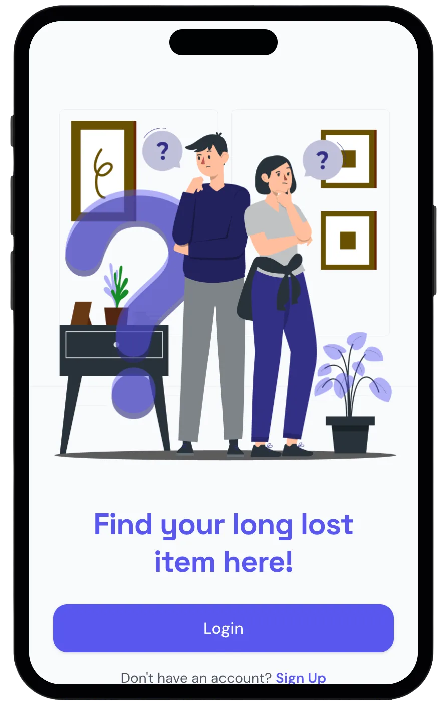
Ten thousand students. Five WhatsApp groups. No search, no verification, no privacy. The message about your lost student ID is buried under 200 new posts by the time you open the app. The problem was not technology. It was trust.
Lead Designer at VinnovateIT, a student innovation lab at VIT. I led four designers and built a shared Figma component library on day one. Made final calls on navigation, visual language, and the claim flow. Designed four core flows from lo-fi to high fidelity prototype in six weeks.
A fully tested high fidelity prototype with four core flows. Four critical label and copy issues caught before engineering handoff. Zero participants who said they would go back to WhatsApp groups.
The Problem
Ten thousand students. Five WhatsApp groups. No way to find anything.
VIT students lose things constantly. The system that existed was five disconnected WhatsApp groups with no categories, no search, and no way to reclaim anything without sharing your phone number publicly with a stranger. We were those students. We decided to fix it.
 No search, no structure
10,000+ students relying on five disconnected WhatsApp groups. Your post is buried under 200 new messages by morning.
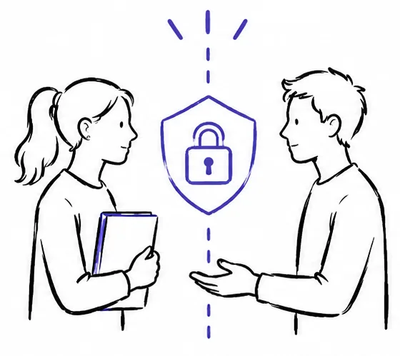 Trust breaks at handoff
Meeting a stranger with no verification felt unsafe. Sharing your phone number publicly before any ownership check was the moment the system failed people most.
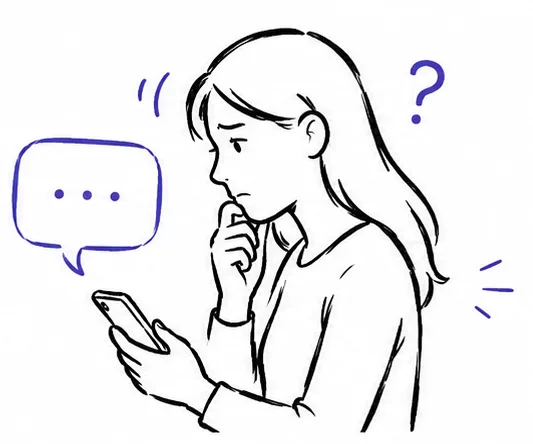 No feedback, no confidence
After posting, students had no way to know if anyone saw it, if the system was working, or what happened next. Uncertainty made people stop using it entirely.
Who We Designed For
 Riya Sharma
Computer Science · 2nd Year · On-Campus · VIT Vellore
"I posted in the group three days ago. I have no idea if anyone saw it. I am not even sure I am looking in the right place."
Riya is three days from exams and her student ID is somewhere in the campus lost and found system — a system she has no confidence in.
Goals
- Find her ID without spending hours scrolling group chats
- Know immediately if anyone found it without following up manually
- Reclaim it without sharing her phone number with a stranger
Frustrations
- Her post got buried under 200 new messages overnight
- No way to tell if the system is working or anyone has seen her post
- The only way to collect her item is to meet a stranger who has her number first
Design Process
From paper to pixels in six weeks.
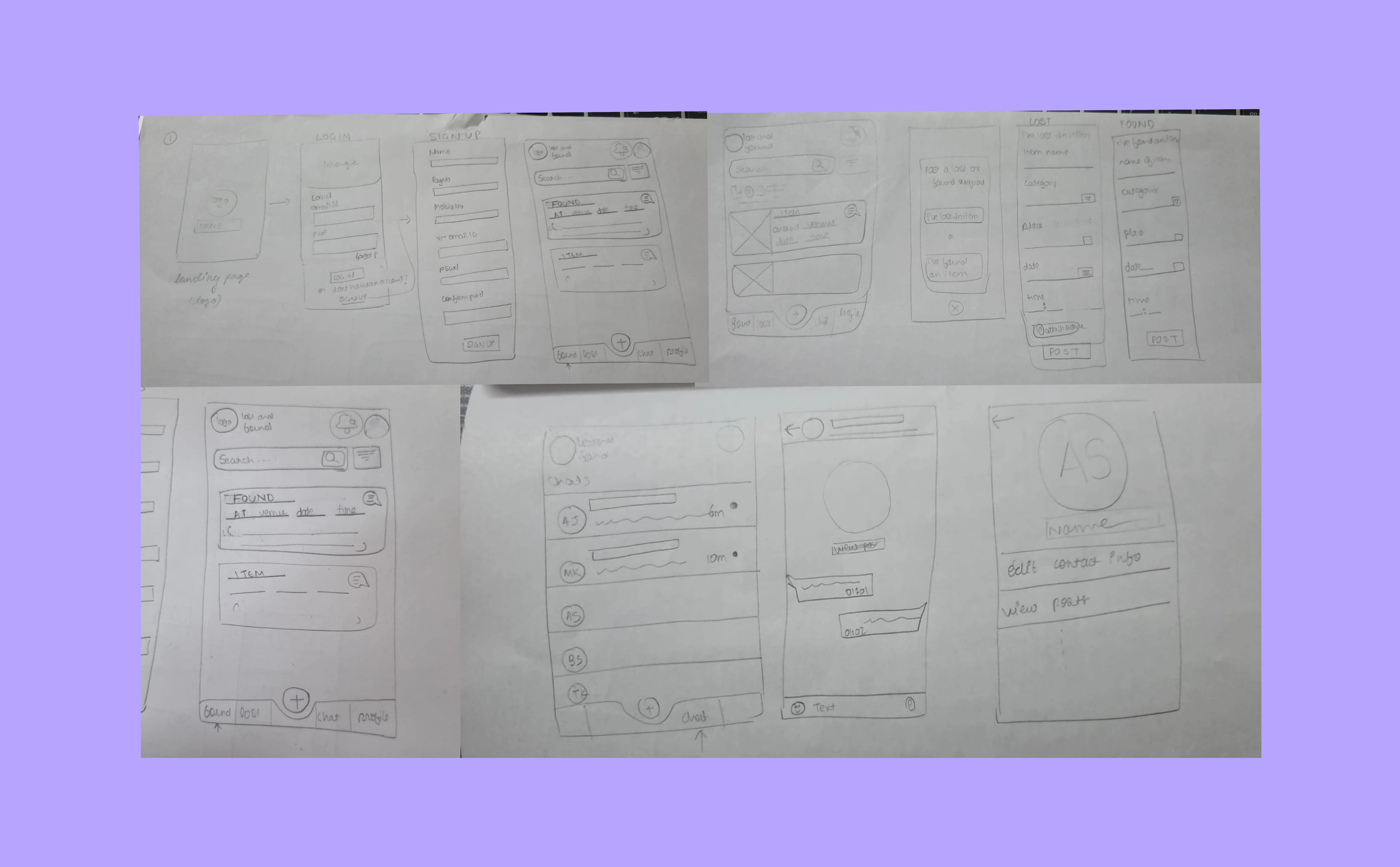 Phase 01 — Lo-fi
Paper first. Four core flows before any screen.
 Phase 02 — Mid-fi
Greyscale and interactive. Structure and navigation validated.
Key Features
Built on trust, not just convenience.
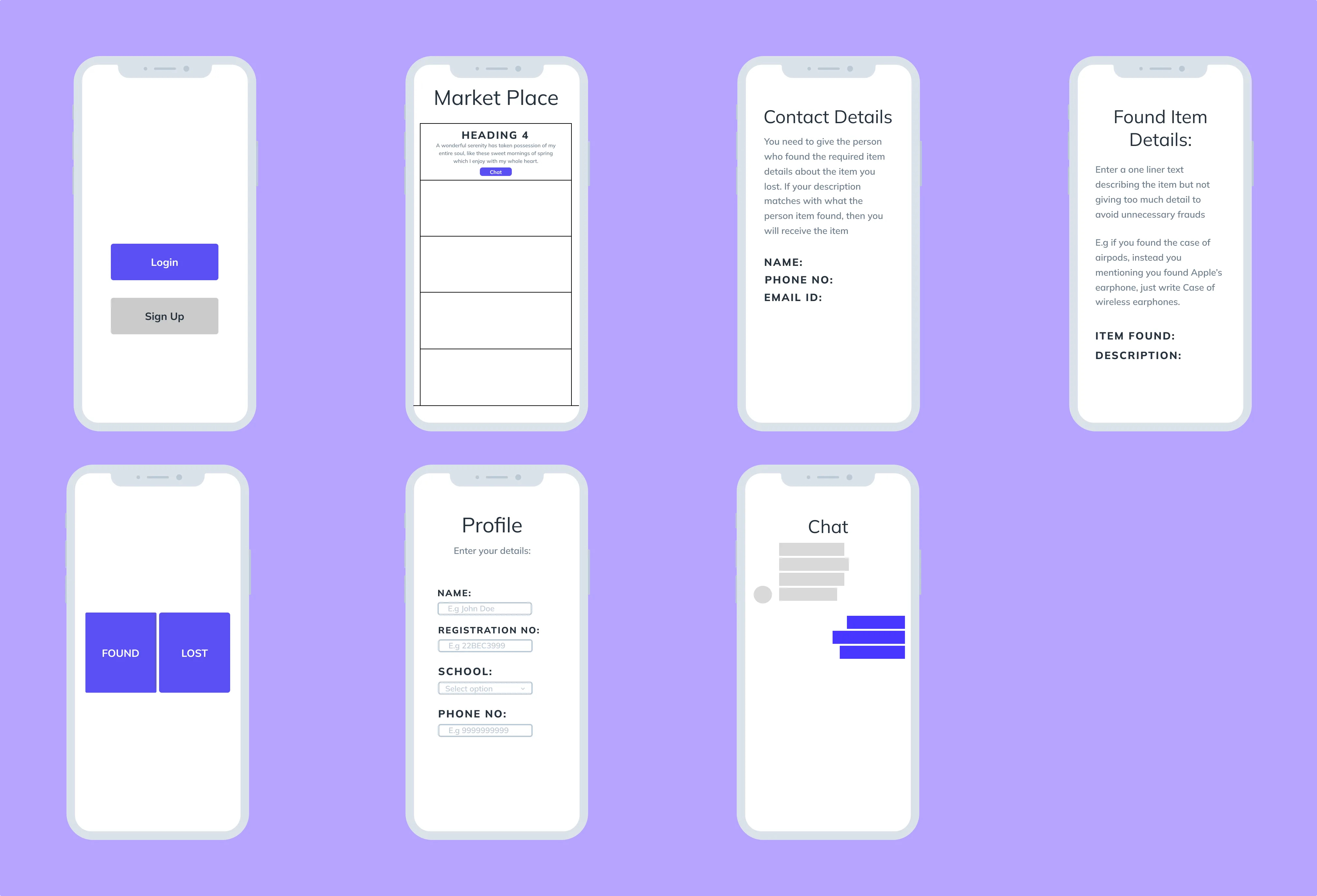
Photo card layout. Filter by category — Electronics, Clothing, ID Cards, Keys. Search by location or date found. Visual recognition beats text descriptions every time and that single observation shaped every layout decision in this flow.
Guided form with structured fields — item name, category, location found, identifying details, photo upload. No guessing what to include. The structure produces posts that are actually searchable.
No contact information shown until both parties verify ownership. Privacy is the default not a setting. This was the feature that mattered most to every single person we designed for.
My Items shows what you posted. My Requests shows what you claimed. Status at all times. The question that drove people to give up on WhatsApp was never where do I search — it was is anything even happening.
See it in action.
Open Prototype ↗Key Takeaways
A central platform was never enough on its own. The privacy architecture, the verified handoff flow, the confirmation screens after every action — those were the real product.
The bookmarking feature would have been useful. It also would have split the team in week three when we needed to be deep in the claim flow. Scope discipline is the only way to actually finish something worth finishing.
The label confusion in the claim flow would have surfaced in a 15 minute hallway test in week one. The later you find a structural problem the more expensive it is to fix.
Next Steps
We built it because we were the students who needed it. That was enough to start.