Fika
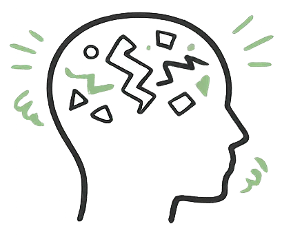
A panic attack means shaking hands and a brain that cannot process choices. We designed Fika for that exact moment. Not after you calm down. During.
View Prototype ↗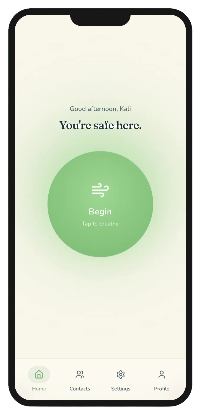
A panic attack means shaking hands, racing thoughts, and a brain that cannot process choices. Most mental health apps make that worse. Fika is built for the first 30 seconds. Not after you calm down. During.
A class project for ISTE264 at RIT. As a UX designer on a team of four, I contributed across all phases: user interviews, affinity mapping, prototyping from paper to high fidelity Figma, and a five task usability study.
100% task success rate. A critical alert failure caught and fixed before it could ship. Four design changes made directly from watching people struggle with the prototype in real time.
The Problem
Mental health apps are built for the wrong moment.
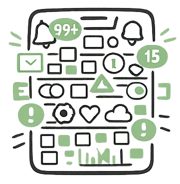
During a panic attack hands are shaking and the brain cannot process choices. Opening a typical mental health app means navigating fifteen features before getting any help.
 Cognitive overload
During a panic attack the brain cannot process choices. Complex navigation becomes impossible exactly when you need help most.
 Too many choices
Most mental health apps show 15 or more features on the home screen. Every extra button is a barrier between you and help.
 Wrong design defaults
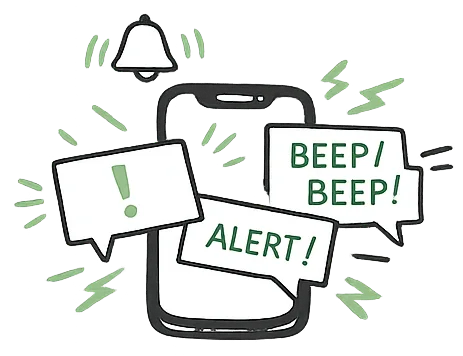
Notifications, bright colors, and complex menus are standard app design. During a crisis they make everything worse.
Research
We asked what people actually do when they are panicking.
Four interviews with college students aged 18 to 22 with self-reported anxiety experiences. No clinical diagnosis required. We also ran a competitive analysis of existing mental health apps to understand what already exists and where it fails.
click a person to read their insight
Select someone from the research.
We interviewed 4 participants recruited through our own networks at RIT. This gave us directional confidence to begin designing — but a larger and more diverse sample would have strengthened these findings significantly.
Who We Designed For

Maya Thompson
Age 18 · BS Applied Psychology · 1st year · On-campus
"When I am anxious, I cannot think straight. I just need something simple that helps me breathe or lets someone know I am not okay."
Maya balances a full course load, part-time work, and campus life. Her anxiety spikes during transitions and exams — moments when her coping tools are least accessible.
Goals
- Regain control quickly, even when thinking feels scattered
- Access grounding tools that require little to no mental effort
- Notify a trusted contact only when I choose to
Frustrations
- Cannot recall coping strategies during peak anxiety
- Interfaces with too many options feel unmanageable
- Apps that require navigating menus before offering help
Design Process
From paper to pixels.
Phase 01 — Ideation
Paper first. Thirteen ideas before we picked one direction.
Phase 02 — Lo-fi
Structure before color. Three problems surfaced immediately.
Phase 03 — Hi-fi
Dark mode. Green over red. One thing to look at.
Usability Testing
Everything worked. Until it didn't.
100% task success rate across all five tasks. But constraint success told a different story — one critical interaction failed 75% of the time, and it was the most important one in the app.
task success rate across all 5 tasks
constraint success on the critical safety alert — the most important interaction in the app
The safety alert disappeared in 4 seconds. 3 out of 4 participants missed it entirely.
Task 2 required participants to accept a contact alert with a single click. The alert had a 4-second timeout before disappearing. While participants were focused on the breathing animation, the alert came and went without being noticed. In a real crisis this would mean help never arrives.
What we changed.
Alert disappeared in 4 seconds
Contact alert stays visible until explicitly dismissed
No sense of time during breathing
Countdown timer added to every phase
Emergency mode status unclear
Persistent active indicator on breathing screen
Accidental exit from emergency mode
Exit redesigned with a confirmation step
Key Features
Designed for the moment everything peaks.
Prototypes shown reflect final designs, refined through usability testing.
You are safe here. One dominant button, nothing else competing for attention. Designed to be found in under five seconds with shaking hands. Green over red — a deliberate choice to signal calm not danger.
Guided 4-7-8 breathing with a countdown timer on every phase. Audio cues, haptic pulses, and a visual circle that expands and contracts. Designed to be followed with eyes closed. Everything configurable in advance so nothing needs deciding mid-crisis.
One tap alerts a pre-configured trusted contact. Mark a favorite for priority. The contact receives a notification and sends back an ETA. Opt-in, never automatic — because research showed the fear of being a burden is stronger than the need for help.
Share your location with a trusted contact after an alert is sent. Three settings — I decide, auto-send, or never. Never forced. Never automatic without explicit permission. This was the feature that failed in usability testing and the one we rebuilt entirely.
Set everything once when calm. Dark mode for low stimulation. Guided audio off by default for public spaces. Haptic pulses on phase change. Custom breathing cycles. Alert behavior. Nothing requires a decision during a crisis because every decision was already made.
Mood check-ins, calm score, usage stats, and badges that build over time. Everything stays on your device — nothing leaves without your permission. A direct response to what every research participant told us they feared most about mental health apps.
See it in action.
Open Prototype ↗Key Takeaways
The 4-second timeout only failed because we measured it with a one-click success criteria. Without the constraint it would have shipped undetected.
Small moments of confusion become significant barriers when cognitive load is already high. Designing for peak stress means designing for zero tolerance for ambiguity.
The I need help now button succeeded because it asked nothing of the user. One dominant element. One action. No decisions. That is the entire design philosophy of Fika.
Next Steps
Research showed distraction is a legitimate coping mechanism. Future versions should include low-stimulation distraction tools like color hunts and object naming games.
The app should behave differently at home versus in public — silent mode, reduced brightness, vibration-only alerts. Location context changes everything.
Our participants had mild to moderate anxiety experiences. Testing with users who have clinical anxiety diagnoses would produce more accurate and actionable findings.
Both are toggled in preferences but not fully realized in the prototype. Audio and haptic guidance are critical for users who cannot look at the screen mid-crisis.
Fika is not finished. But it is already better because real people used it.