One-Click Resume Builder:
A Psychology Problem
Redesigning a resume builder for first-year STEM students who were overwhelmed and anxious — by removing choices, not adding features. Sometimes UX problems are psychology problems. No amount of better buttons fixes self doubt.
The Problem
The Real Barrier Was Emotional, Not Functional
STEM-Away's One-Click Resume platform already existed when I joined as a UX Design Intern. The problem: students were abandoning it halfway through. My job was to figure out why and redesign it to reduce anxiety and increase completion. The instinct from the product team was to add more templates. More options. More features.
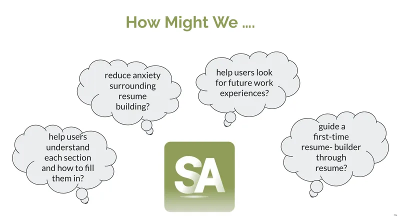
Through interviews, I discovered the real barrier was emotional, not functional. Students were not abandoning because the tool was buggy. They were abandoning because they did not feel confident in what they had to put in it ("I do not have anything worthwhile"). They were afraid of doing it wrong ("What if recruiters think this is bad?"). They did not want to show incomplete work ("It is not ready yet").
"Sometimes UX problems are psychology problems. No amount of better buttons fixes self doubt."
Research & Discovery
Stakeholder Mapping to Affinity Diagramming
Working with the STEM-Away design team, I followed a structured research process: stakeholder mapping, then user interviews, then empathy mapping, then affinity diagramming. Each step forced a more honest understanding of the problem before I touched a wireframe.
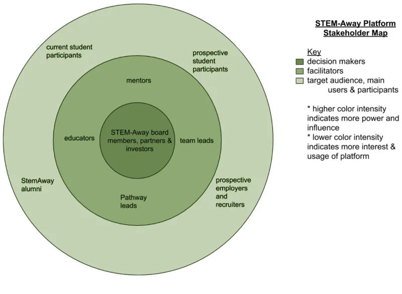
Stakeholder mapping identified 8 distinct user groups with genuinely different needs: first time resume builders, international students, STEM majors, non technical students, returning users, career switchers, internship seekers, and graduate students. Treating these as one persona would have designed for no one.
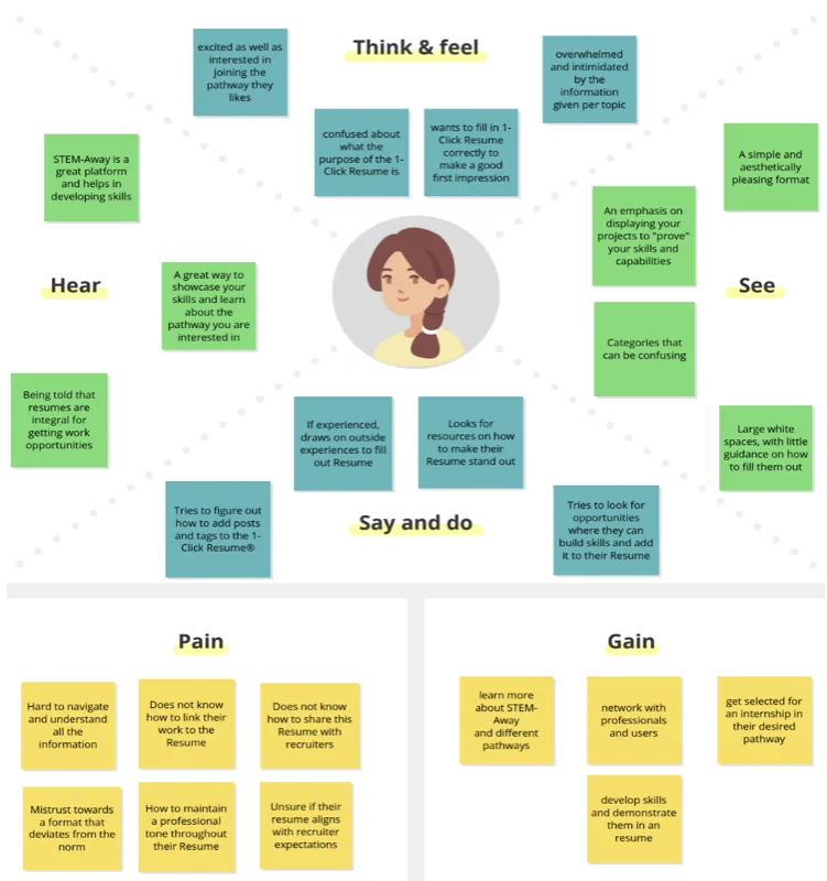
User interviews focused on emotional experience, not feature requests. I was not asking "what features do you want?" I was asking "how does this make you feel?" Two quotes defined the entire design direction: "I do not know what to put here — I just have this blank field staring at me." And: "I do not want recruiters seeing this until it is perfect."
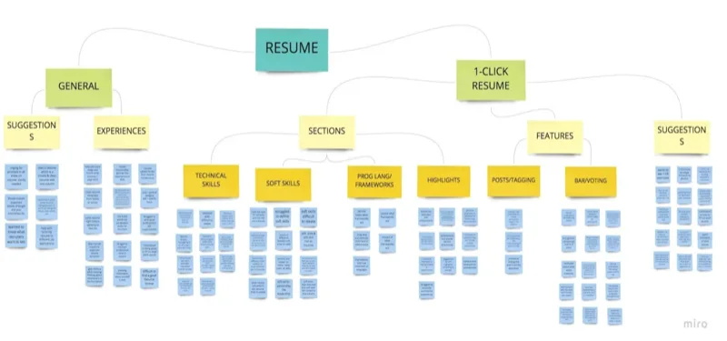
Affinity diagramming organized all interview feedback into themes. Six core pain points emerged: blank page syndrome, writing anxiety, technical terminology confusion, privacy concerns, formatting overwhelm, and imposter syndrome. Every feature in the redesign traced back to one of these six.
Design Approach
Designing for Confidence, Not Just Completion
The principle driving every decision: reduce, do not expand. Instead of blank fields, structured categories. Instead of "write your experience here," specific prompts: "What problem did you solve? Who benefited? What was the measurable impact?" Instead of one visibility state, four: Everyone, Students only, Recruiters only, Private.
Students were not afraid of the tool. They were afraid of being judged. Giving them control over who sees their work — and when — removed that fear entirely. Working privately until they felt ready was not a nice to have. It was the thing that made the whole experience feel safe enough to use.
Redesigned Features
Four Features. All Addressing Emotional Barriers.
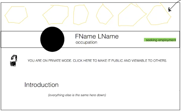
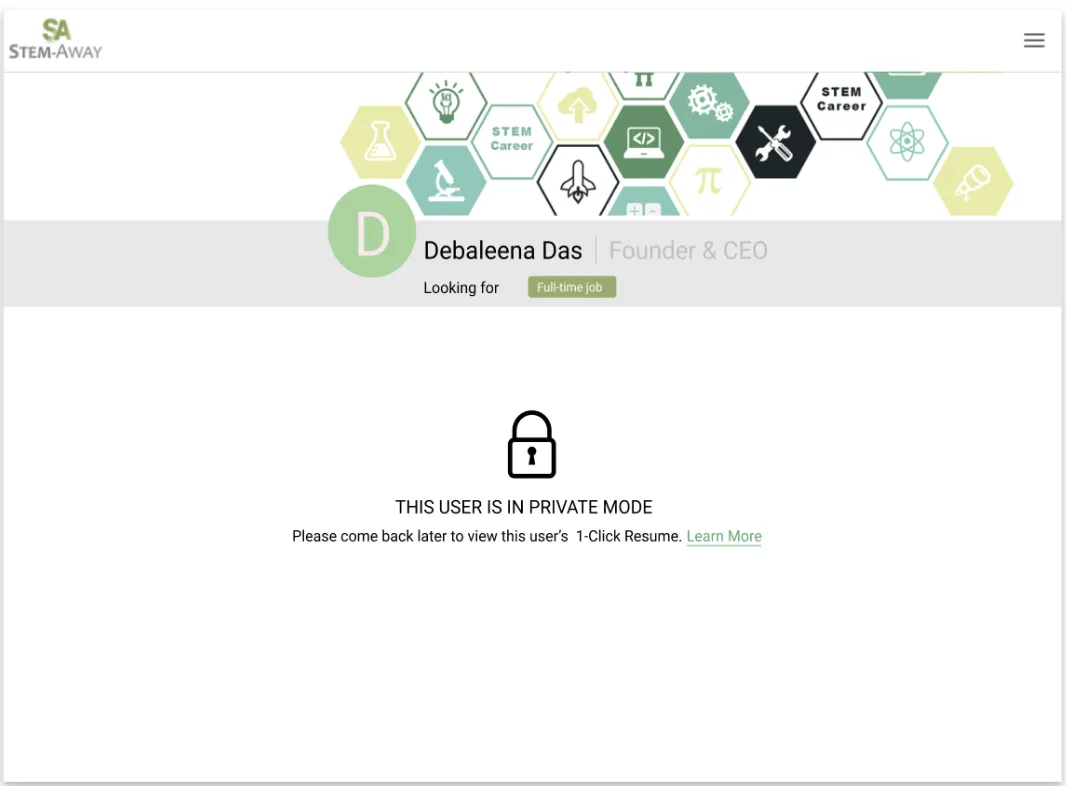
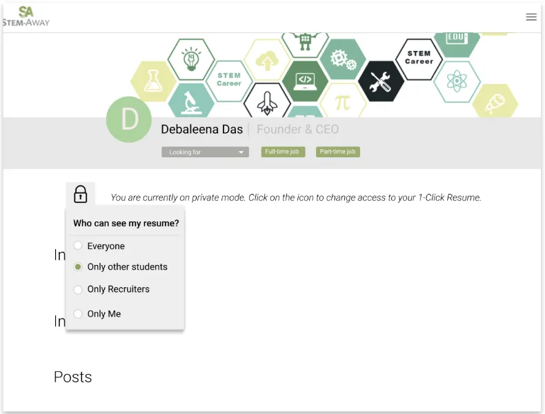
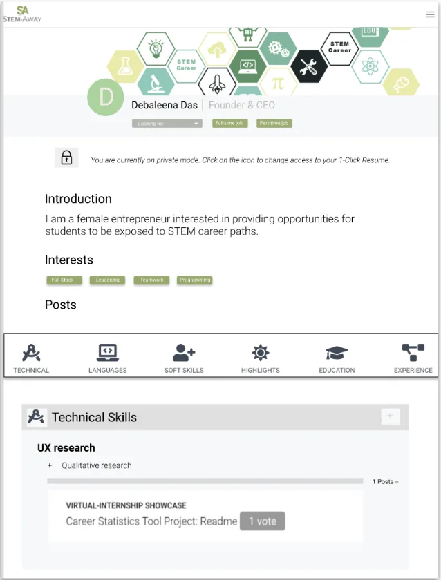
Privacy controls with four visibility levels. Everyone, Students only, Recruiters only, Private. Students could build in private mode until they felt ready to share. This single feature addressed the most common reason for abandonment: fear of being seen before feeling ready.
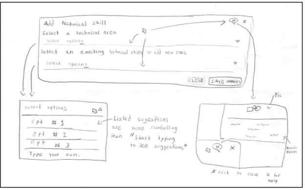
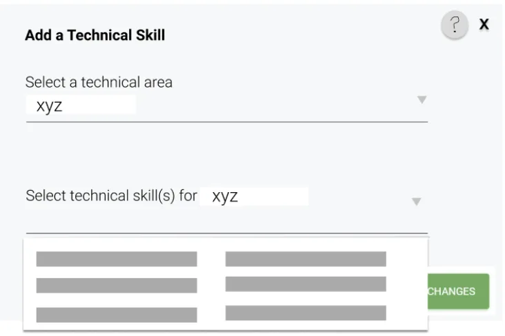
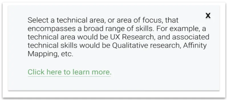
Guided technical skills entry. Hierarchical skill categories plus a contextual help popup. Rather than a blank field demanding a self assessment, structured categories reduce decision fatigue. When you are overwhelmed, fewer choices equals less anxiety.
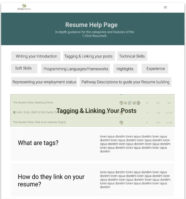
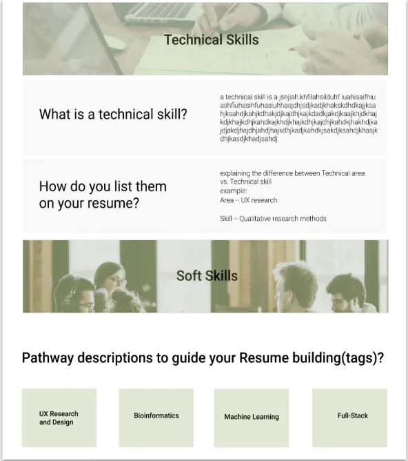
Section by section help pages. Every resume section included contextual help with specific prompts: "What problem did you solve? Who benefited from your work? What was the measurable impact?" These were not generic tips — they were written specifically for first year STEM students with limited professional experience.
Linear guided flow. One section at a time, step by step. A blank form with 10 sections is paralyzing. A linear flow gives structure and a visible sense of progress — exactly what students needed to keep going.
High Fidelity
The Final Product
The high fidelity design integrated the three primary new features — the resume overview page, contextual help popups, and the help page system — alongside the existing builder infrastructure. The design preserved the structure students already knew while replacing the parts that caused abandonment.
Outcomes
What Happened — And What I Do Not Know
The redesign was presented to 500+ international STEM-Away students at a virtual career fair. The response was positive and students validated that the features addressed their actual pain points. A patent application was filed for the privacy control and guided skill categorization innovations — the first time the platform had produced IP from a student led design project.
But the redesign was not implemented during my internship. That means I do not have actual completion rate data, time to complete metrics, user satisfaction scores, or A/B test results comparing old versus new. I have strong research insights and a validated concept, but I cannot claim the redesign definitively improved outcomes. I designed a solution, but did not get to measure its real world impact.
That is the biggest limitation of this project. Next time, I would advocate for at least a small pilot test — even 20 students over two weeks — to validate that the redesign actually works in practice. Research without validation is still hypothesis.