 002
Social Media Design
002
Social Media Design
VinnovateIT
VinnovateIT needed a visual identity that could launch three different products to two different platforms without losing coherence. I built the design system and created 20+ posts that made each launch feel distinct and the brand feel consistent at the same time.
The Brand
A Student Club With Three Products and One Visual Voice.
VinnovateIT is a student innovation organization at Vellore Institute of Technology. They were not just posting updates. They had products and events to promote, each with different audiences and different goals. MessIt, VinHack, and Lost and Found each needed their own moment on social media while staying recognizably VinnovateIT. That is a design systems problem dressed up as a content problem.
"Good design at scale requires systems, not just taste. Build the system once, benefit from it forever."
My job was to figure out how to do all of this with a student volunteer team and a tight turnaround before each launch date. That meant building templates, not just posts. Patterns, not just aesthetics.
Social Identity
Three Content Pillars. One Recognizable Brand.
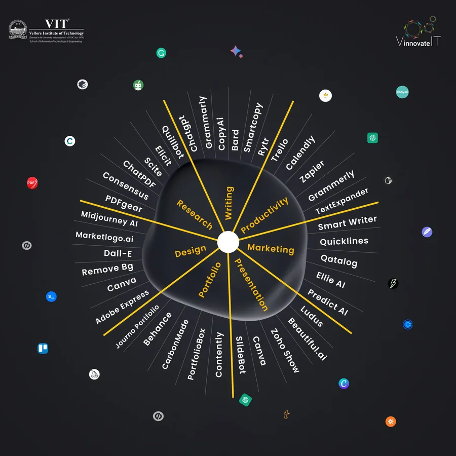
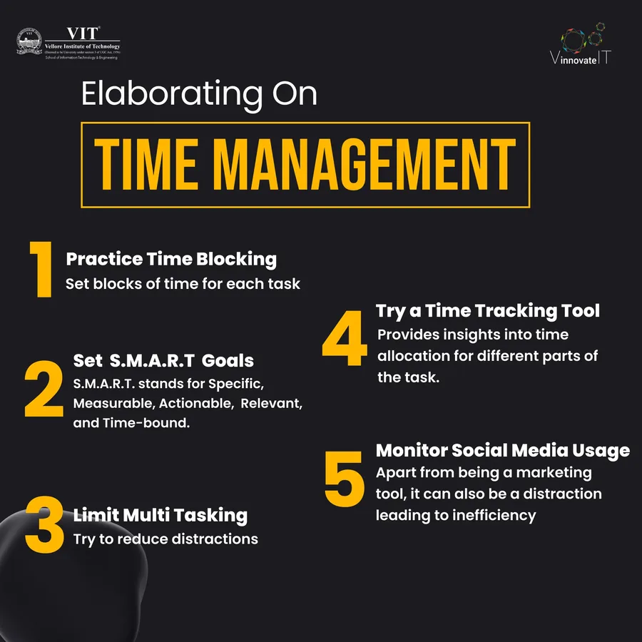
I started by establishing the visual rules: typography scale, color usage per product, grid structure for carousel posts. Once those were set, anyone on the team could execute a post that felt on-brand without needing a design review for every piece.
Each of the three projects got its own visual campaign. The design challenge was making each feel distinct, not just individual posts that happened to share a logo. That meant consistent color language per project, carousel structures that built anticipation across slides, and copy that spoke to each audience without sounding generic.
VinnovateIT as a parent brand needed its own consistent presence separate from individual product launches. This meant developing a visual language for organizational updates, team spotlights, and milestone content that felt authoritative but still student-run and approachable.
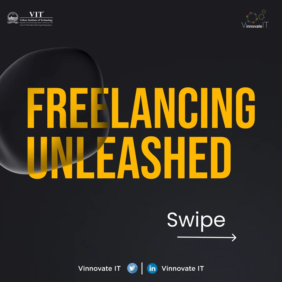
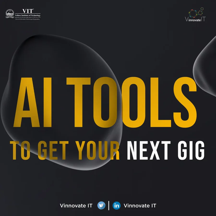
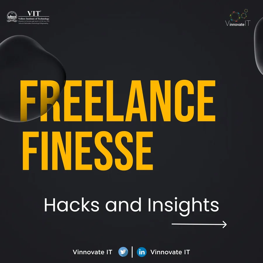
VinHack was the biggest single event in the content calendar. Event promotion has its own design grammar: countdown content, registration CTAs, day-of coverage, recap posts. I designed the full arc for VinHack from announcement through wrap-up.
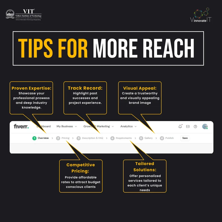
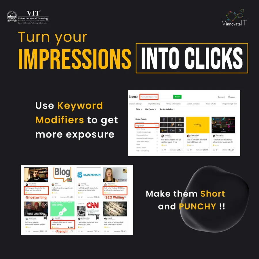
Instagram and LinkedIn are not just different audiences. They are different reading modes. Instagram users scroll fast and stop for visuals. LinkedIn users read captions. I adapted every post for both: different aspect ratios, different caption lengths, different calls to action. The same content, engineered to land differently on each platform.
Selected Work
The Posts That Launched Three Products.
These are the carousel series and individual posts from across all three product campaigns. Each group represents a distinct visual identity within the broader VinnovateIT brand system.
Part 1
Part 2
Part 3
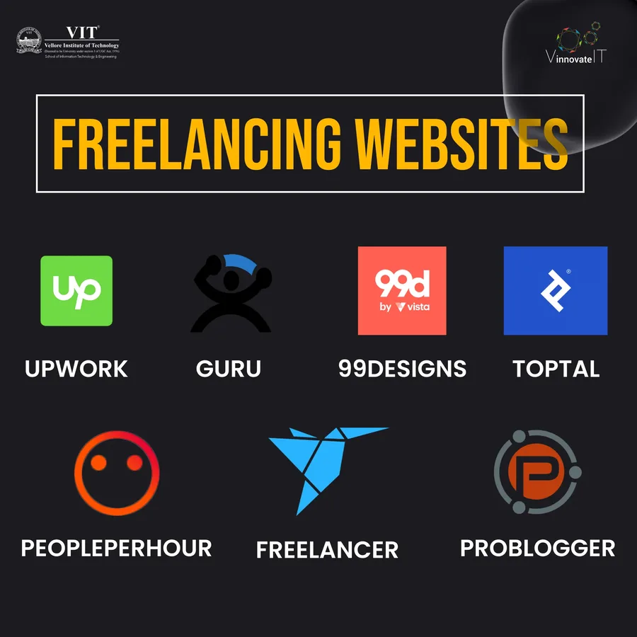
Campaign Series — MessIt, VinHack, and Lost and Found
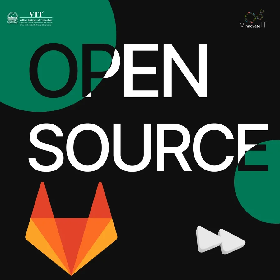
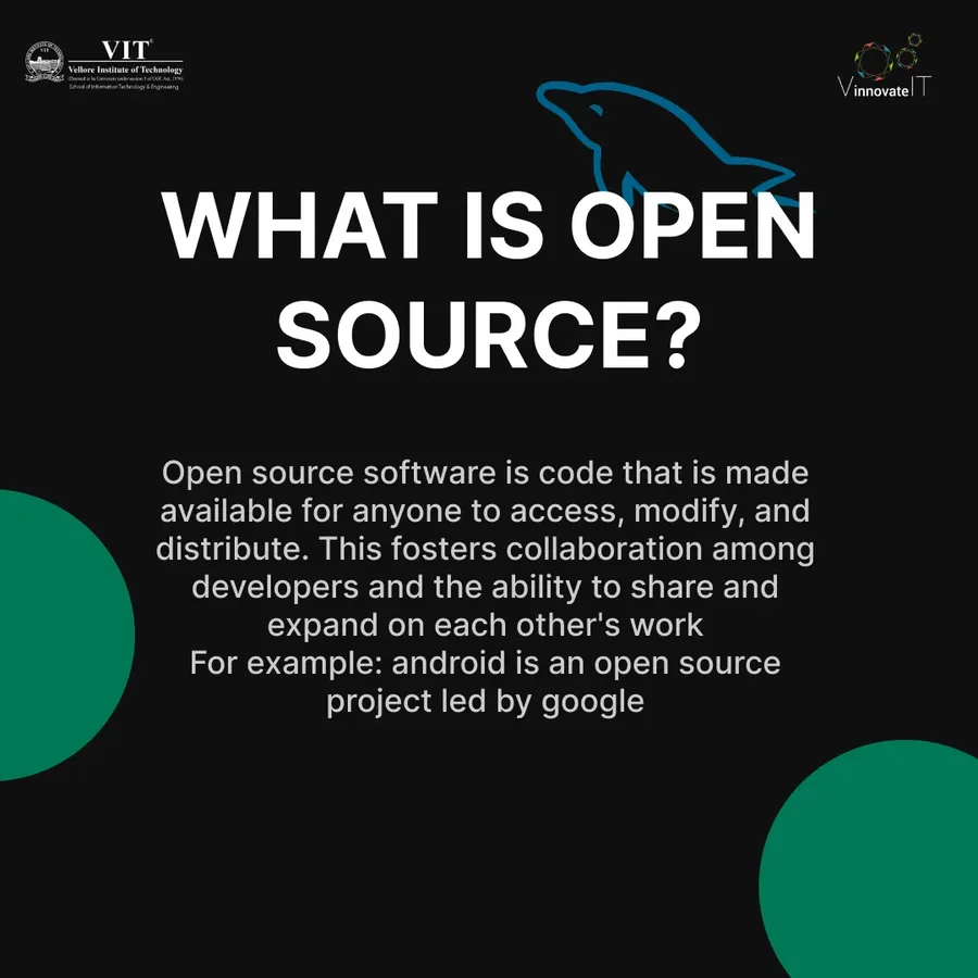
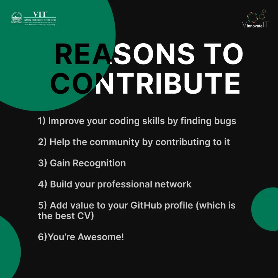
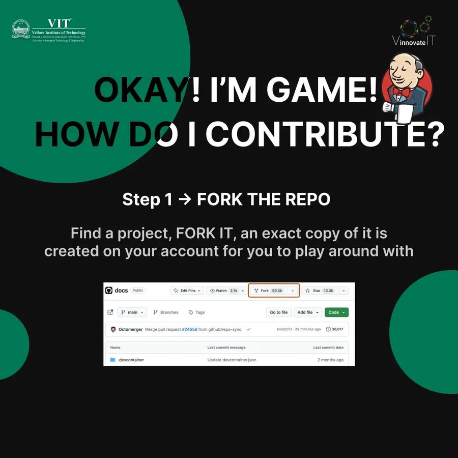
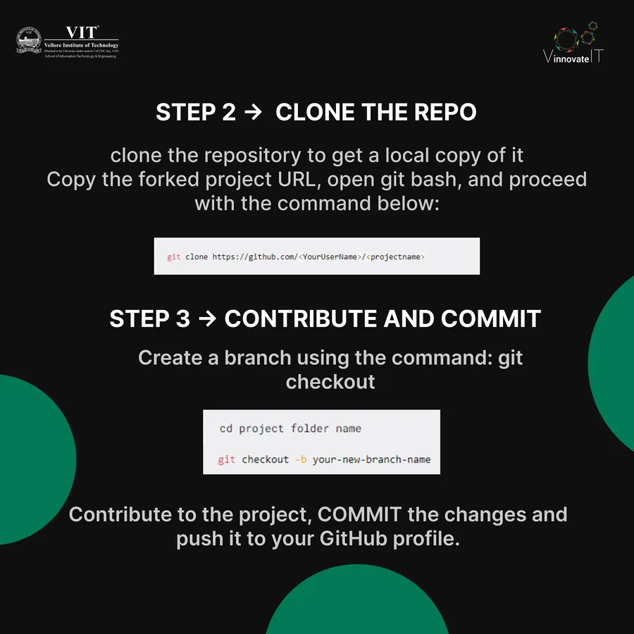
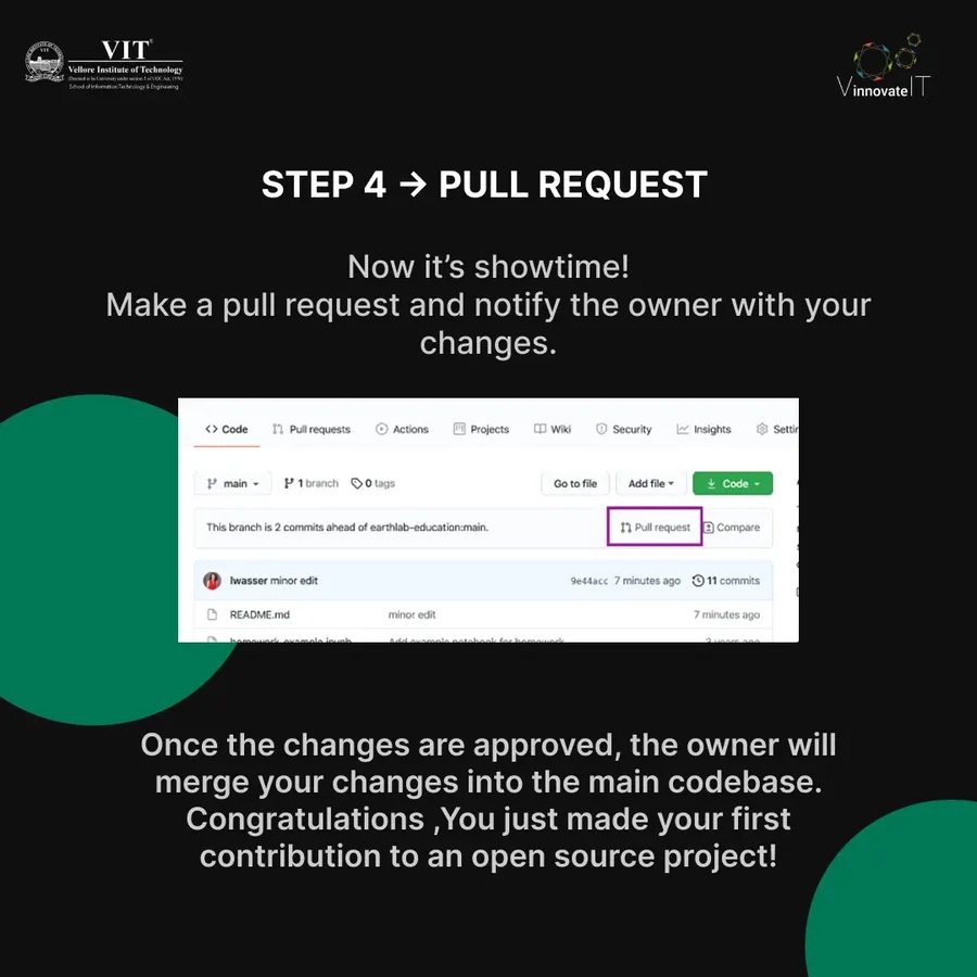
Campaign Series 4 — Open source and community content
Reflection
What Building a Brand System Taught Me.
VinnovateIT was my first real experience designing at the system level rather than the post level. The constraint of coherence across three very different products forced me to think about brand differently. A logo and a color palette are not a brand identity. The way every post feels when it lands in someone's feed is the brand identity.